Choosing the right colour scheme for a website is one of the most important design decisions you will make. Colour affects how easy a site is to read, how trustworthy it feels, and how long visitors are willing to stay.
Long before modern web design, the same principles were used in books, signage, and shop displays: good contrast, limited palettes, and colours that suit the purpose rather than follow fashion.
This post looks at proven colour combinations for various types of websites, with practical palettes and hex codes you can use as a starting point.
1. Online Shops & Ecommerce Websites
What works best: Clean, neutral bases that let products stand out. This mirrors traditional shop displays, with simple backdrops, clear pricing, and subtle accents.
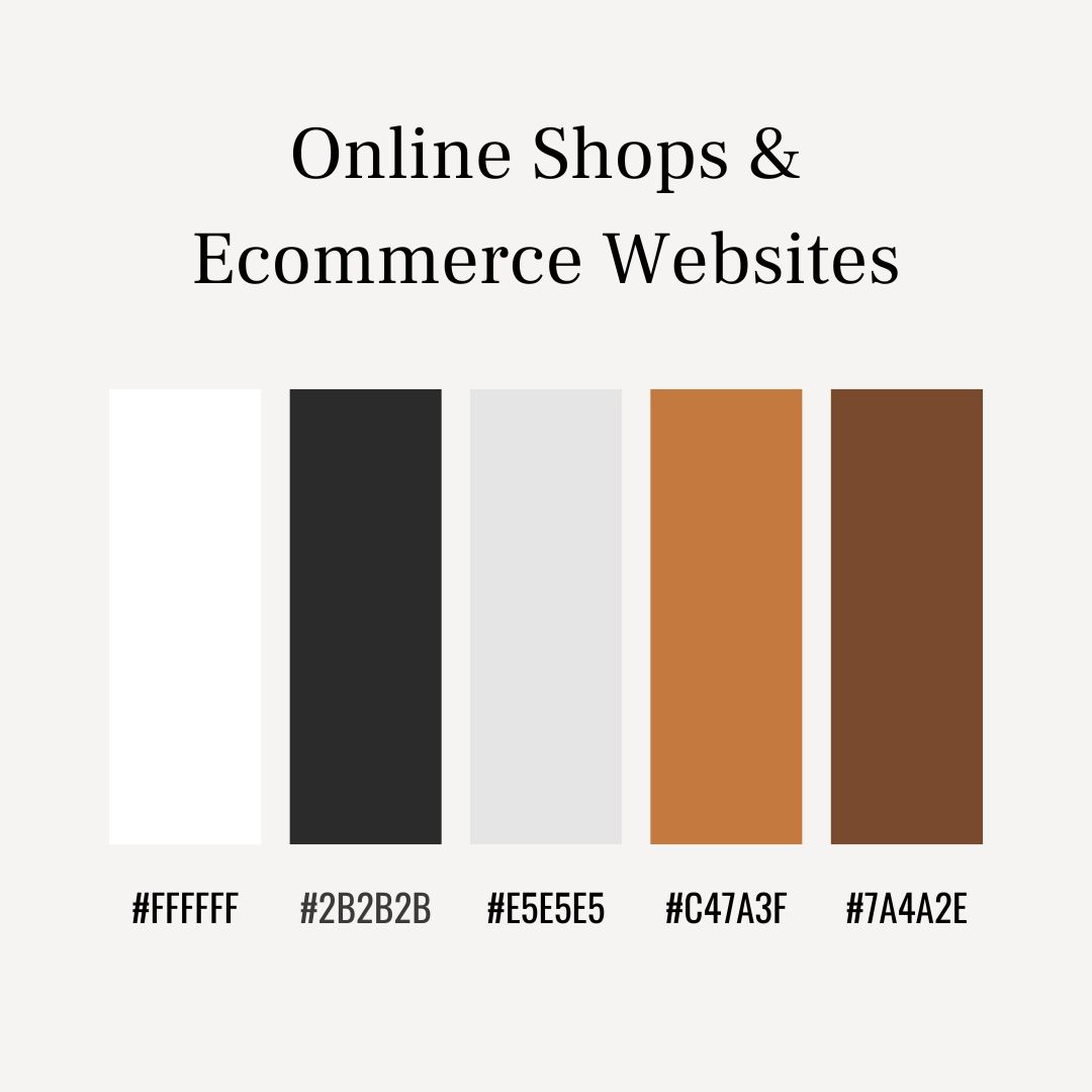
Recommended palette: White – #FFFFFF Charcoal – #2B2B2B Soft Grey – #E5E5E5 Muted Bronze (accent) – #C47A3F Warm Brown (secondary accent) – #7A4A2E
Why it works: This palette keeps the focus firmly on the products. White and soft grey create a clean, uncluttered setting, while dark charcoal text ensures prices and descriptions are easy to read. Muted bronze and warm brown accents add warmth and a sense of quality, subtly highlighting important elements without overwhelming the page.
2. Blogs & Personal Websites
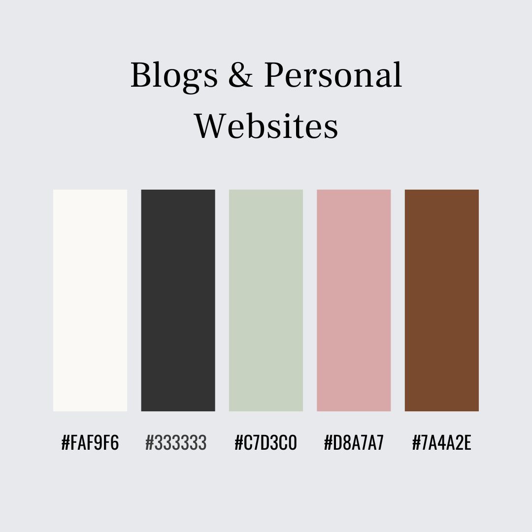
What works best: Soft, calm colours that don’t compete with long-form reading.
Recommended palette: Off-White – #FAF9F6 Soft Charcoal – #333333 Pale Sage – #C7D3C0 Dusty Rose (accent) – #D8A7A7 Warm Taupe – #8B7E74
Why it works: These colours are gentle and familiar, making long articles easier to read and more inviting. Off-white backgrounds reduce eye strain, while soft charcoal keeps text clear without feeling harsh. Muted green and dusty rose accents add personality without distracting from the content, creating a calm and trustworthy reading experience.
3. Business & Professional Services Websites
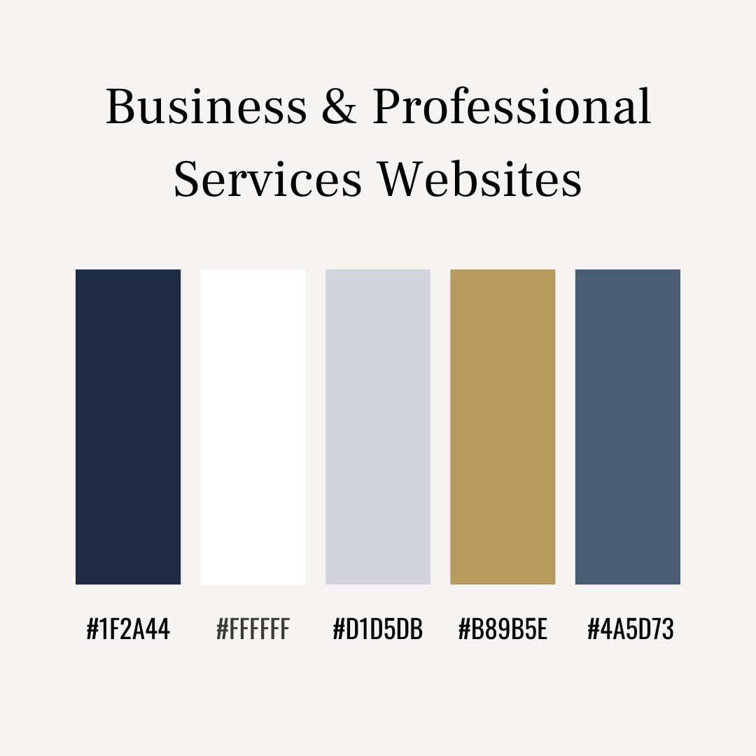
What works best: Colours associated with reliability and order.
Recommended palette: Navy – #1F2A44 White – #FFFFFF Cool Grey – #D1D5DB Muted Gold (accent) – #B89B5E Slate Blue – #4A5D73
Why it works: Navy and slate tones convey trust and competence. White space keeps the layout structured and easy to follow, while cool greys soften the overall look. A restrained gold accent adds authority and confidence without tipping into excess.
4. Creative & Portfolio Websites
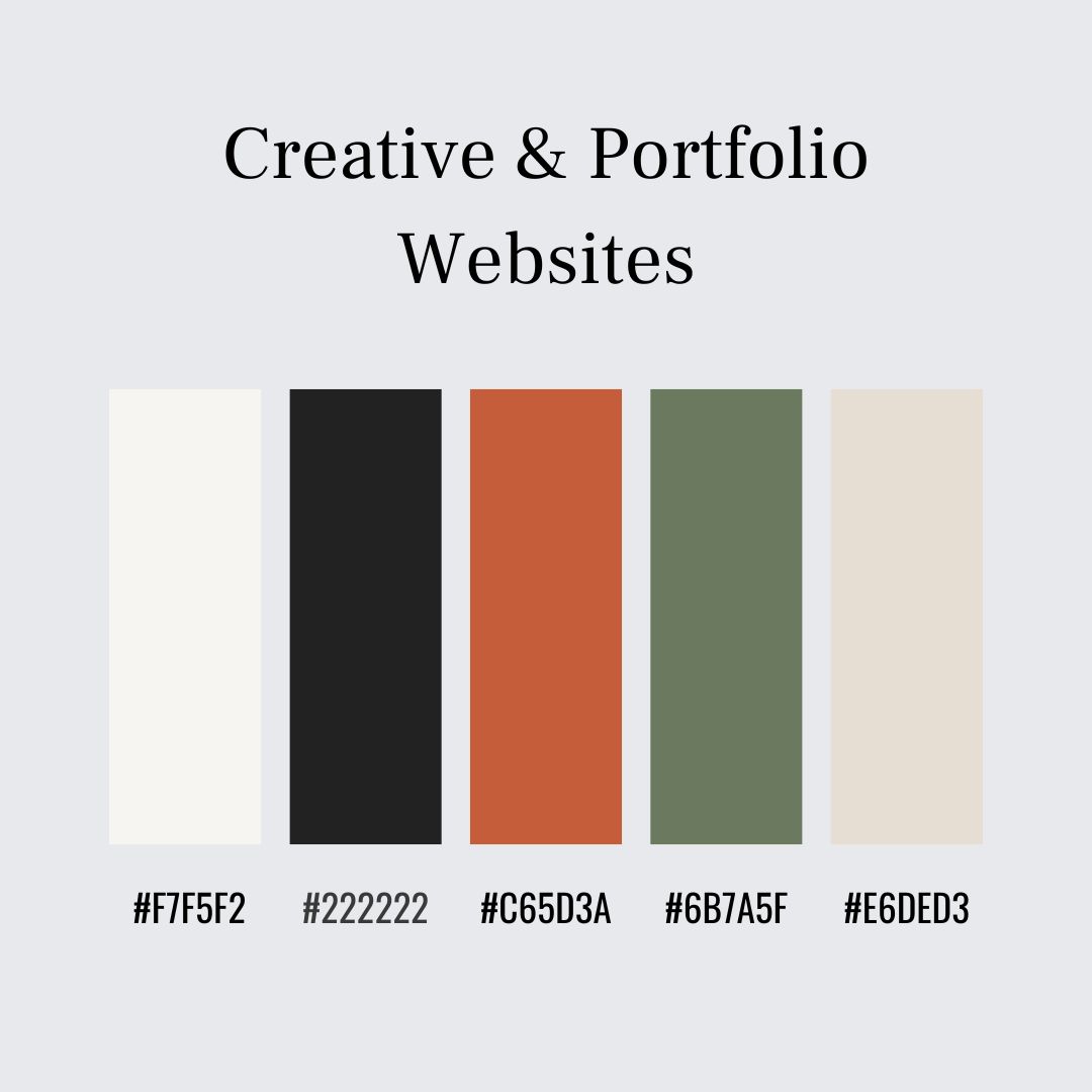
What works best: Neutral foundations with one strong accent.
Recommended palette: Warm White – #F7F5F2 Deep Charcoal – #222222 Terracotta (accent) – #C65D3A Muted Olive – #6B7A5F Soft Sand – #E6DED3
Why it works: Neutral tones act like gallery walls, allowing creative work to take centre stage. A single warm accent like terracotta introduces character and warmth. The overall effect feels considered and timeless rather than tied to a trend.
5. Wellness & Lifestyle Websites
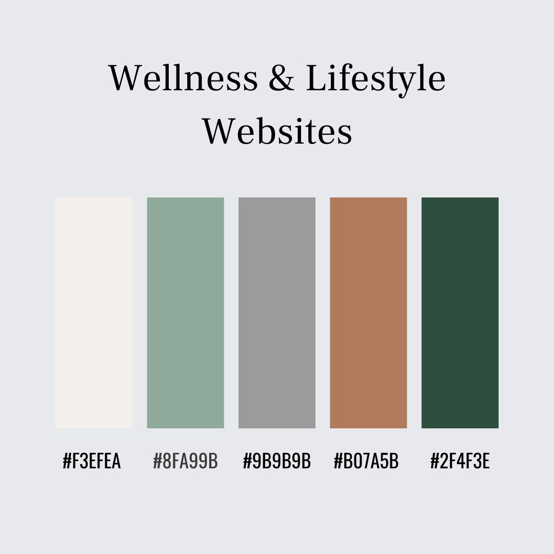
What works best: Natural, muted colours inspired by traditional interiors and textiles.
Recommended palette: Soft Cream – #F3EFEA Muted Green – #8FA99B Warm Grey – #9B9B9B Clay – #B07A5B Deep Forest – #2F4F3E
Why it works: Natural, muted colours create a sense of calm and stability. Soft creams and greens feel grounded and familiar, while warmer earth tones add depth without sharp contrast. This supports a slower, more thoughtful browsing experience that encourages trust and ease.
6. Charity, Community & Information Websites
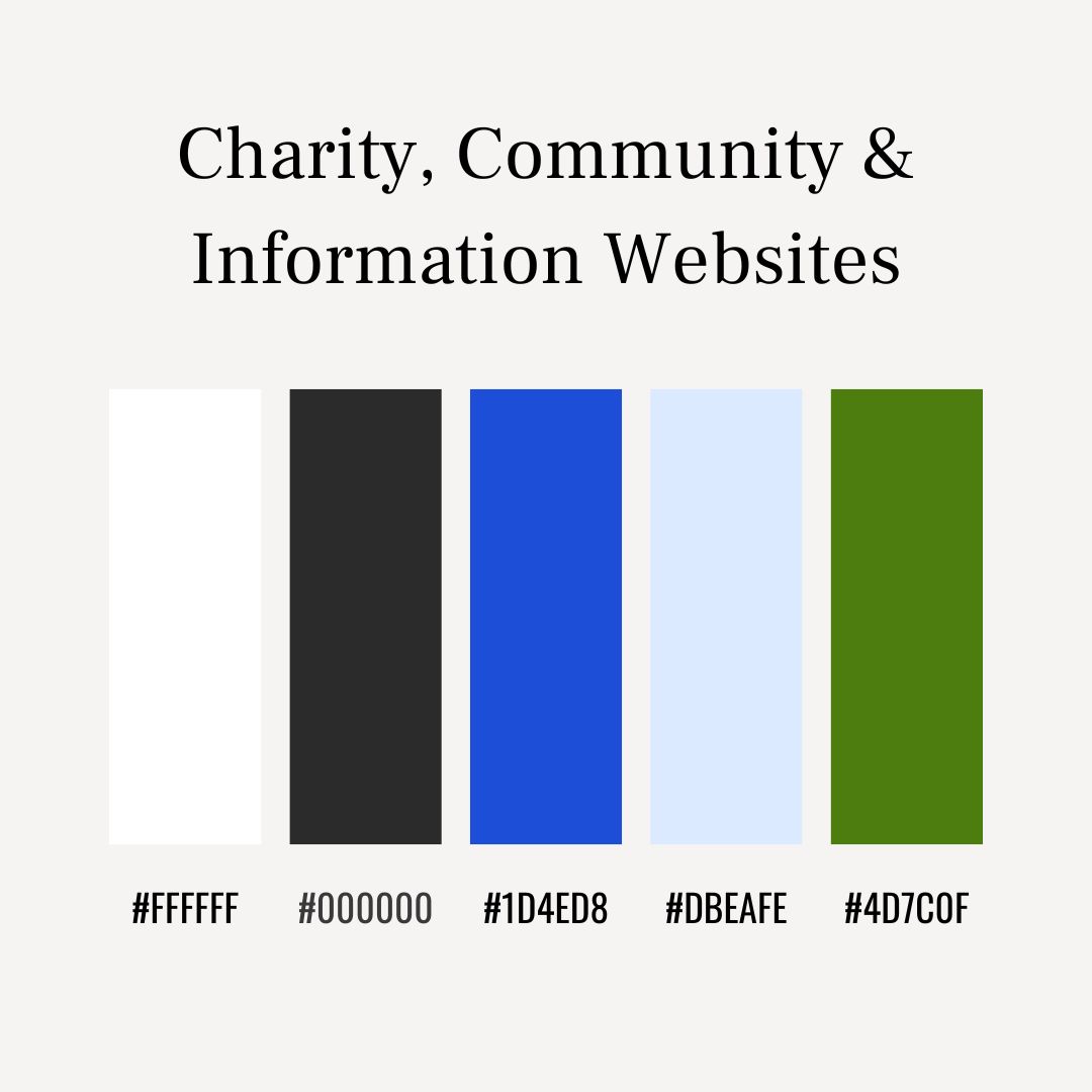
What works best: High contrast for accessibility, with one friendly accent colour.
Recommended palette: White – #FFFFFF Black – #000000 Strong Blue – #1D4ED8 Soft Sky – #DBEAFE Leaf Green (accent) – #4D7C0F
Why it works: High contrast between light backgrounds and dark text ensures information is easy to read. Blue communicates reliability and professionalism, while a green accent adds warmth. The palette is clear, accessible, and reassuring.
7. Beauty & Skincare Websites
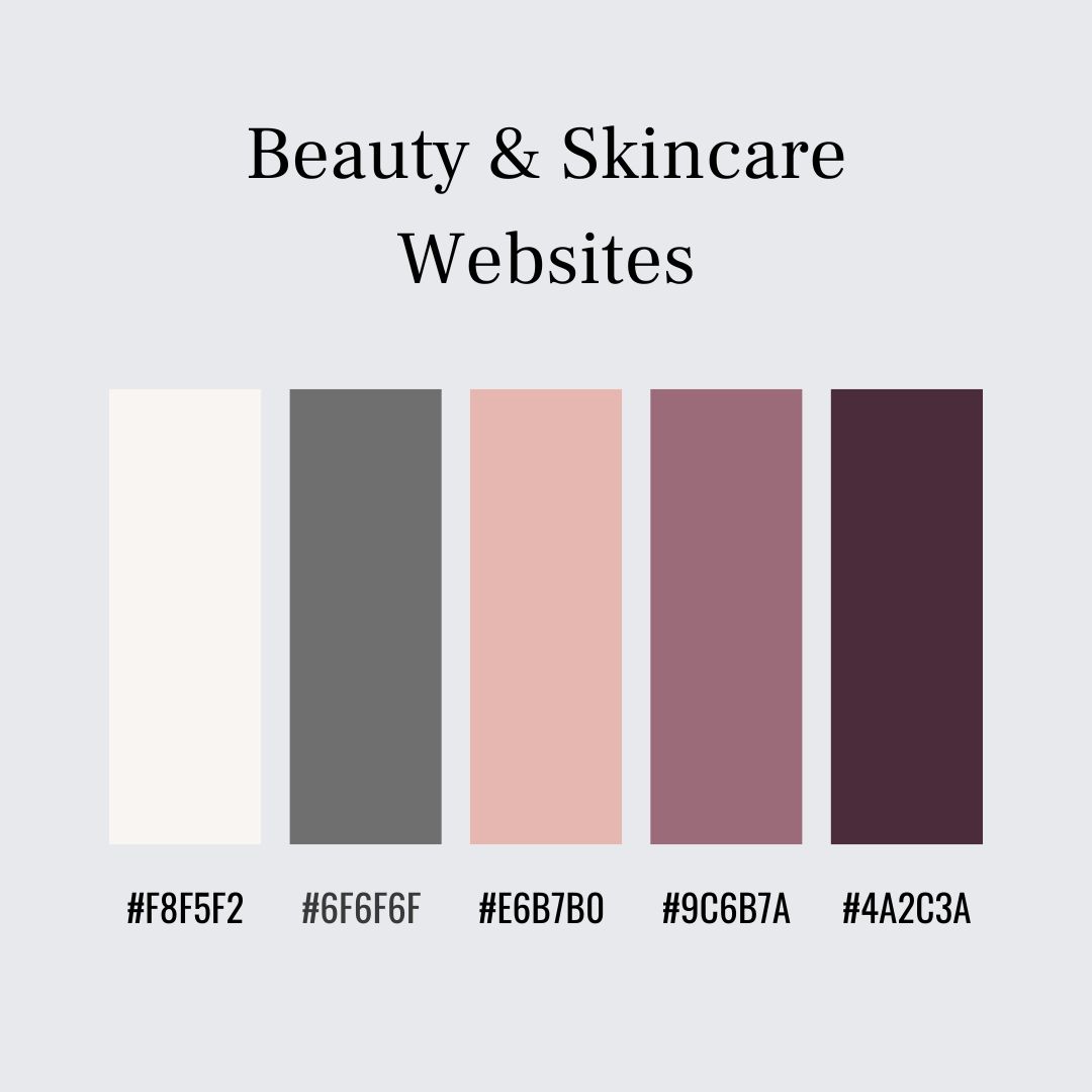
What works best: Soft neutrals with one elegant accent, reflecting traditional packaging and apothecary-style branding.
Recommended palette: Soft Ivory – #F8F5F2 Warm Grey – #6F6F6F Blush Nude – #E6B7B0 Muted Mauve (accent) – #9C6B7A Deep Plum – #4A2C3A
Why it works: These colours feel refined and reassuring. Soft, light backgrounds keep the site clean, while muted pinks and mauves suggest care and elegance. Deeper tones add contrast and a sense of quality without overpowering the page.
8. Gift & Lifestyle Shops
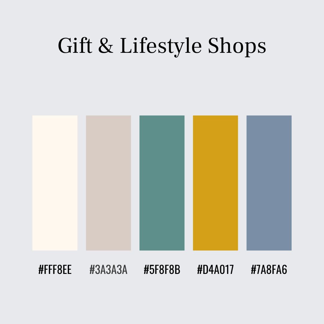
What works best: Warm, welcoming colours suitable for a wide range of products.
Recommended palette: Cream – #FFF8EE Soft Charcoal – #3A3A3A Muted Teal – #5F8F8B Warm Mustard (accent) – #D4A017 Dusty Blue – #7A8FA6
Why it works: Cream and soft charcoal provide a neutral base, while teal and dusty blue add interest without being seasonal. A warm mustard accent highlights offers and buttons, echoing the appeal of thoughtful gift wrapping.
9. Education & Course Websites

What works best: Clear, reassuring colours that support focus and learning.
Recommended palette: Soft White – #FBFBF9 Ink Blue – #243A5E Mid Grey – #B8BCC2 Muted Teal (accent) – #4F8A8B Warm Ochre – #C9A24D
Why it works: Deep blue grounds the site and suggests reliability, while soft whites and greys keep pages uncluttered. Gentle accent colours add interest and guidance without distracting from the learning content.
10. Food, Recipe & Home Cooking Websites

What works best: Warm, familiar colours inspired by kitchens and traditional food packaging.
Recommended palette: Cream – #F6F1E7 Rich Brown – #5A3E2B Sage Green – #9BAE9C Terracotta (accent) – #C96A4A Soft Charcoal – #3B3B3B
Why it works: Cream backgrounds feel homely, earthy greens and browns connect with ingredients, and terracotta accents draw attention to recipes or calls to action.
11. Technology & Software Websites

What works best: Restrained, high-contrast palettes that feel organised and dependable.
Recommended palette: White – #FFFFFF Graphite – #1F2933 Cool Grey – #CBD5E1 Calm Blue (accent) – #2563EB Soft Cyan – #7DD3FC
Why it works: Strong contrast keeps information easy to scan, while blues suggest reliability and competence. Controlled accents make the site feel stable and professional.
12. Photography Websites
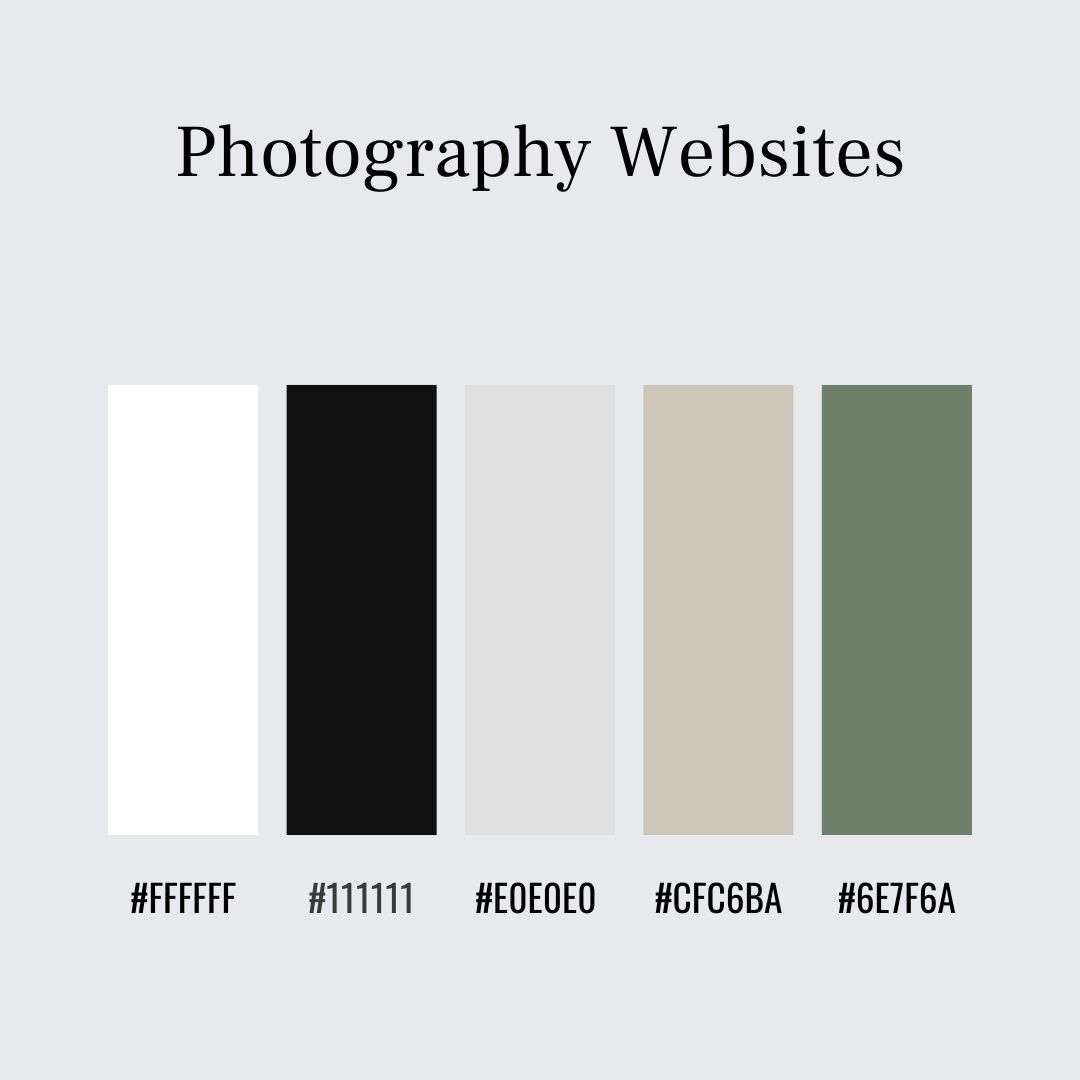
What works best: Very neutral palettes that allow images to remain the focus.
Recommended palette: Pure White – #FFFFFF Near Black – #111111 Soft Grey – #E0E0E0 Warm Stone – #CFC6BA Muted Olive (accent) – #6E7F6A
Why it works: Neutral tones frame images without competing, while a single understated accent adds subtle structure to navigation and headings.
13. Local, Heritage & Craft Businesses
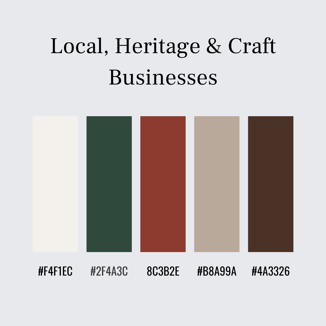
What works best: Earthy, traditional colours that suggest longevity and trust.
Recommended palette: Antique White – #F4F1EC Deep Green – #2F4A3C Brick Red – #8C3B2E Warm Stone – #B8A99A Dark Brown – #4A3326
Why it works: These colours feel rooted and familiar, echoing traditional signage and packaging. They communicate care, craftsmanship, and reliability.
14. Travel, Hotels & Accommodation Websites
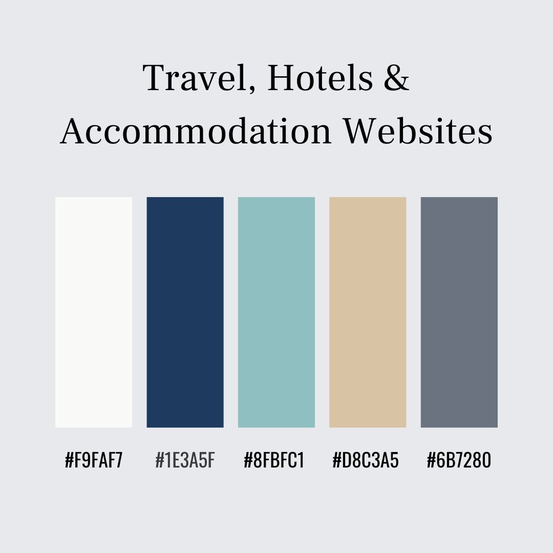
What works best: Calm, aspirational colours that suggest comfort and cleanliness.
Recommended palette: Soft White – #F9FAF7 Deep Blue – #1E3A5F Seafoam – #8FBFC1 Warm Sand (accent) – #D8C3A5 Slate Grey – #6B7280
Why it works: Blues convey trust and cleanliness, while seafoam and sand tones subtly reference landscapes. The palette is restful and reassuring.
15. Non-Profit, Faith & Community Organisations
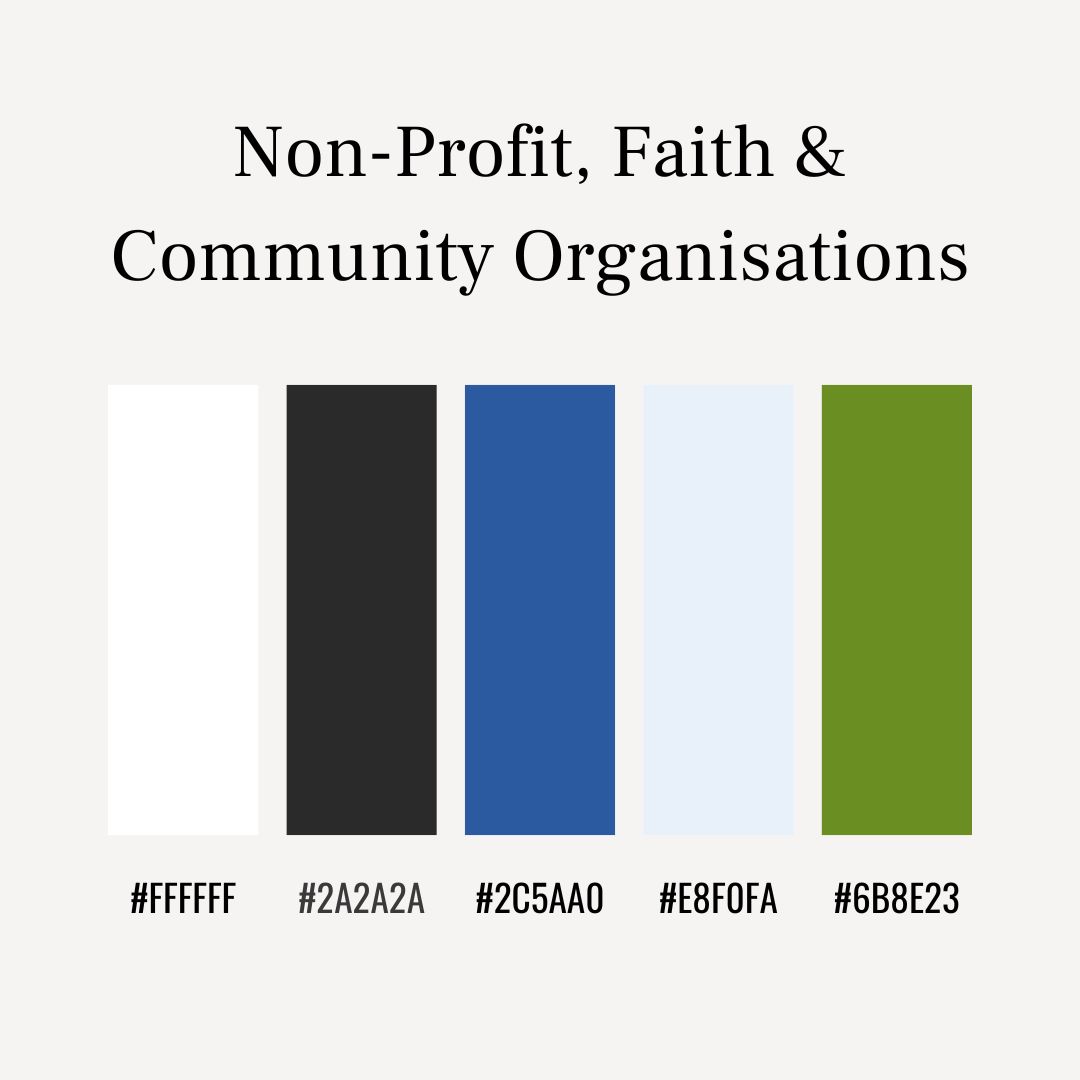
What works best: Straightforward, familiar colours that feel sincere and accessible.
Recommended palette: White – #FFFFFF Charcoal – #2A2A2A Mid Blue – #2C5AA0 Soft Sky – #E8F0FA Olive Green (accent) – #6B8E23
Why it works: Clear contrast supports readability, blue communicates reliability, and green accents suggest care and continuity. The palette feels honest and welcoming.
16. Children’s Brands & Educational Toys
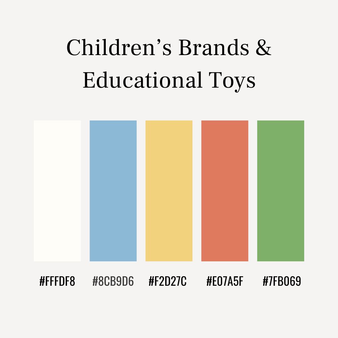
What works best: Gentle, cheerful colours that feel friendly without overstimulation.
Recommended palette: Warm White – #FFFDF8 Soft Blue – #8CB9D6 Muted Yellow – #F2D27C Coral (accent) – #E07A5F Gentle Green – #7FB069
Why it works: Soft tones keep pages readable for parents, while brighter accents add warmth and approachability. The balance mirrors traditional children’s books and learning materials.
17. Pet, Animal & Veterinary Websites
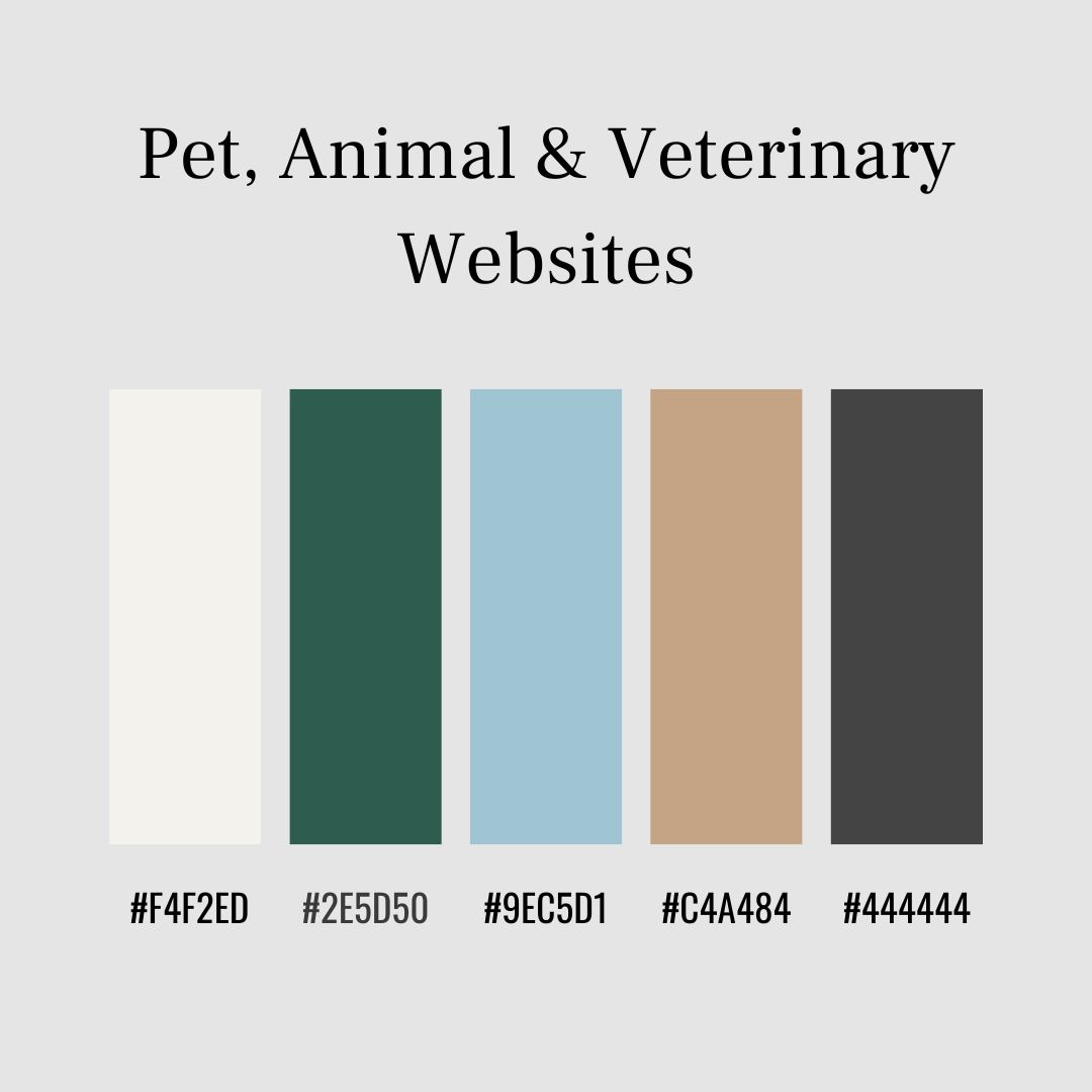
What works best: Reassuring, natural colours that suggest care and trust.
Recommended palette: Soft Cream – #F4F2ED Forest Green – #2E5D50 Sky Blue – #9EC5D1 Warm Tan (accent) – #C4A484 Dark Grey – #444444
Why it works: Greens and blues feel calming and dependable. Warm neutrals soften the look and prevent the site from feeling clinical, creating a welcoming space for pet owners.
18. News, Editorial & Magazine-Style Websites
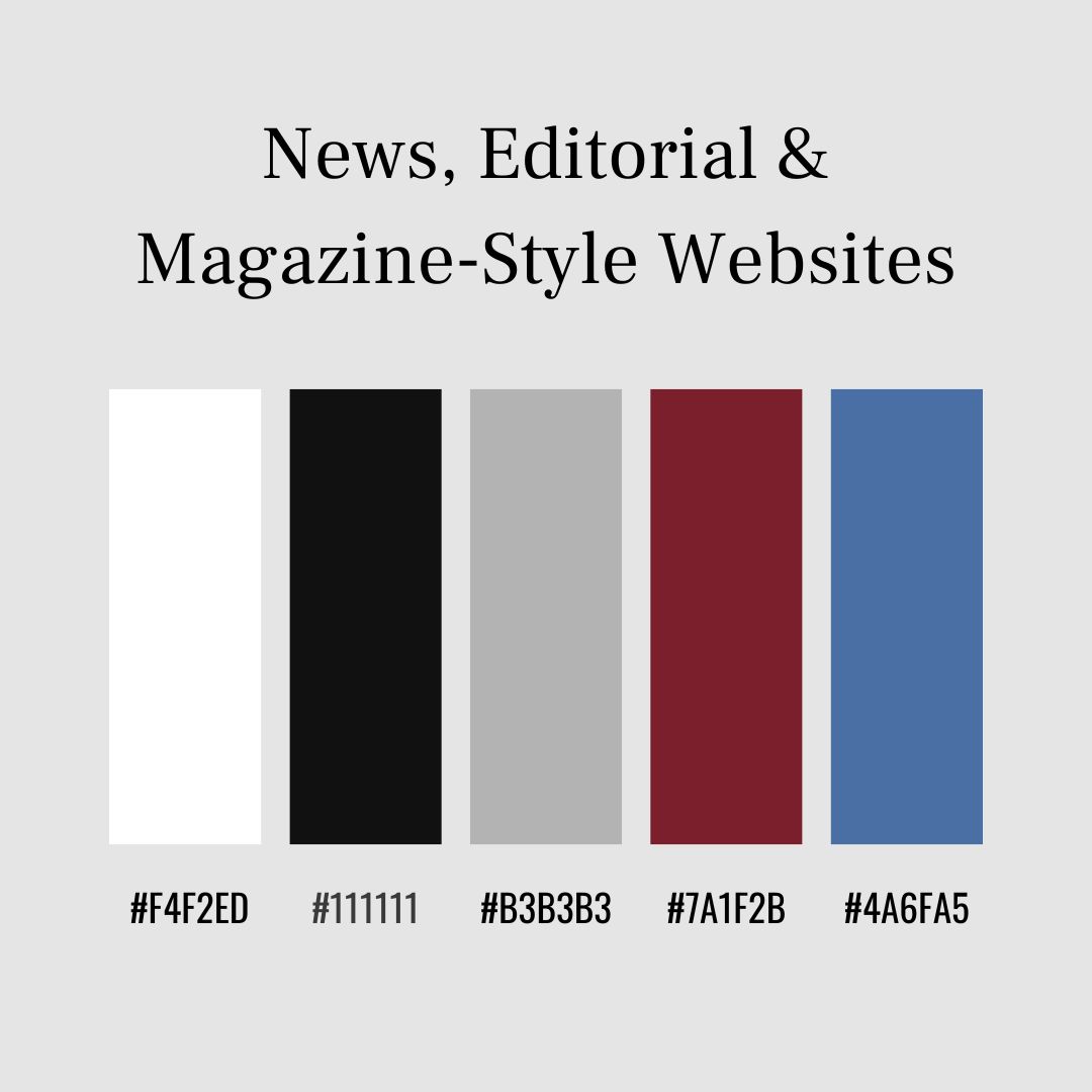
What works best: High-contrast, restrained palettes that prioritise reading and structure.
Recommended palette: White – #FFFFFF Black – #111111 Mid Grey – #B3B3B3 Burgundy (accent) – #7A1F2B Steel Blue – #4A6FA5
Why it works: Strong contrast keeps articles readable and organised. A single deep accent adds hierarchy and emphasis without distracting from the content.
19. Events, Weddings & Celebrations
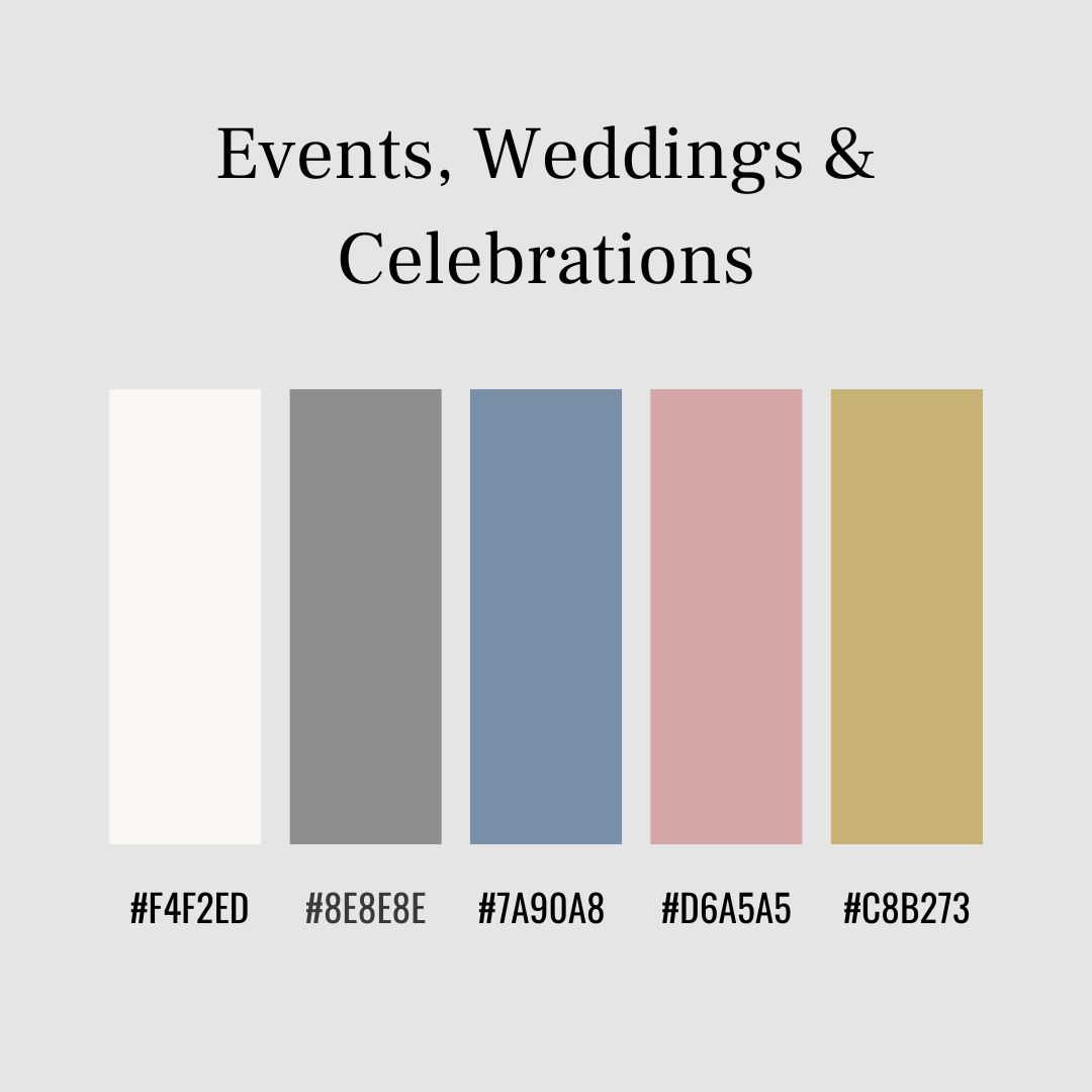
What works best: Soft, elegant colours that feel special.
Recommended palette: Ivory – #FAF7F2 Dove Grey – #8E8E8E Dusty Blue – #7A90A8 Blush (accent) – #D6A5A5 Soft Gold – #C8B273
Why it works: Neutrals create calm structure, while gentle accents add warmth and occasion, similar to traditional stationery and invitations.
Final Thoughts
While these colour schemes are drawn from commonly used website layouts and familiar colour pairings, there is no single correct palette for any website. Much of it comes down to personal taste, the audience you are trying to reach, and what feels right for the content you are presenting.
Colours that work beautifully for one site may feel wrong for another, even within the same industry. The key is to start with clarity and readability, then adjust until the site feels balanced and comfortable to use.
If you would like to understand colour and layout in more depth, traditional design books remain one of the best resources. Interaction of Color by Josef Albers explains how colours influence one another in practice, while The Elements of Typographic Style by Robert Bringhurst shows how colour and type work together for readability.